


Not every website needs a “concept,” but they’re some of my favorite to create. When I started working on Kelsey’s site, it was obvious her brand needed more than just nice words on a page. She needed a throughline—something that tied every headline, every section, every CTA back to her personality and the experience she gives her couples.
And for Kelsey, that throughline became camp. We leaned into nostalgia, adventure, and connection to give her website a voice and vibe that matched what she delivers for her couples: an experience that feels structured but free, lighthearted but meaningful, and 100% true to them.
The Brand
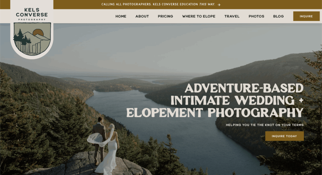
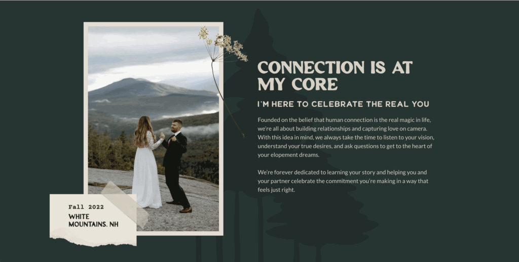
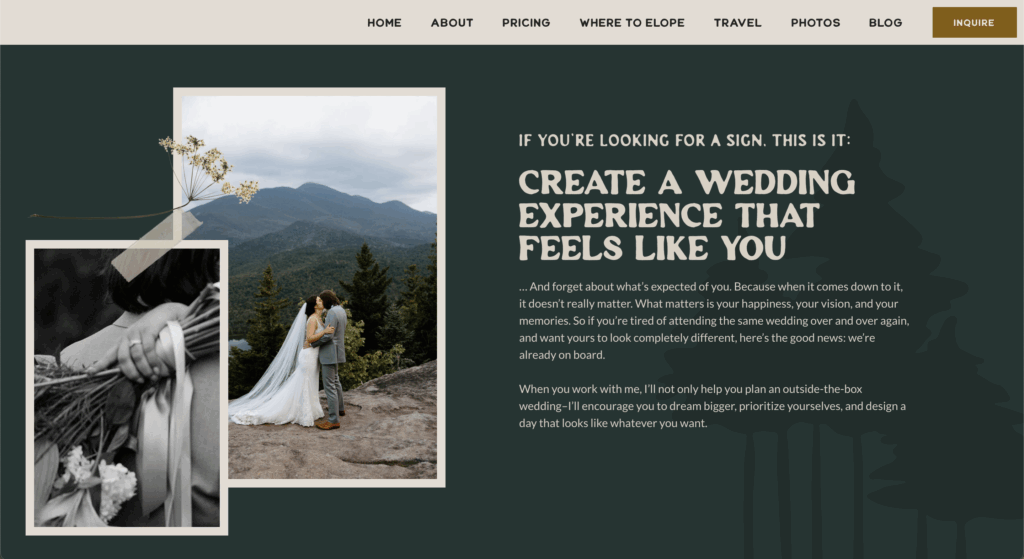
Kelsey is an adventure-based elopement and intimate wedding photographer in New England. She started as a landscape photographer, which is why her photos feel so rooted in place: the White Mountains, Acadia, the coastline. Her couples aren’t just standing in front of a view; the view matters.
And her brand isn’t just about photography. It’s about connection, guidance, and making people feel like they belong. Which is why the camp theme worked so perfectly: it’s welcoming, it’s fun, and it reminds couples they don’t have to follow the “big wedding” rulebook to have a meaningful day.
The Goals
Before we dove into the words, we got clear on what this new website needed to accomplish:
- Differentiate her brand. In a market full of moody mountain elopement photographers, Kelsey needed a hook that was memorable and unmistakably her.
- Attract the right people. Couples in their 30s who are adventurous but still family-focused, craving something different but unsure where to start.
- Build trust through guidance. Position Kelsey as more than a photographer: she’s the guide, the planner, the voice of calm when everyone else has opinions.
The camp concept gave us a framework that checked every one of those boxes while still leaving plenty of room for personality.
The Messaging
The camp theme wasn’t just for funsies—it was the strategy. We used it to build messaging that spoke directly to her dream couples:
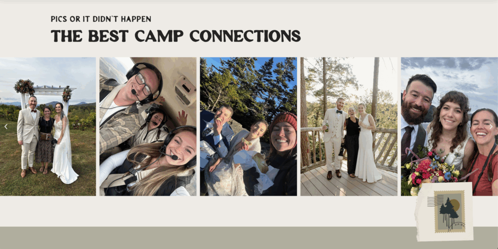
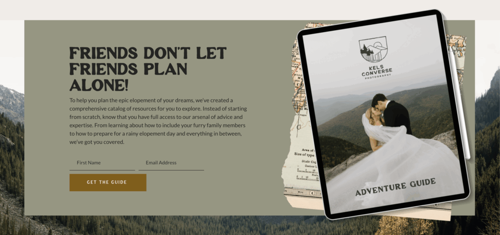
- Belonging. The copy makes couples feel like they’re joining a community (camp!) rather than buying a service. From the “Best Camp Connections” gallery to “friends don’t let friends plan alone,” it’s all about inclusivity.
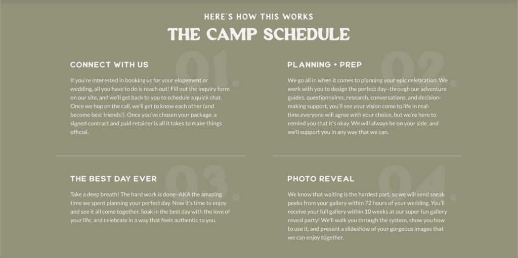
- Guidance. Instead of industry jargon, we leaned on camp language to show structure: “The Camp Schedule” for her process, an “Adventure Guide” as her lead magnet. Couples immediately feel like someone’s got their back.
- Playfulness. The camp metaphor gave us space to add cheeky touches that lighten the pressure. Because yes, planning your wedding is a big deal, but it doesn’t have to feel heavy.
Every page was grounded in these three pillars, which kept the copy cohesive and unmistakably tied to Kelsey’s brand.
My Favorite Part(s)
I mean with this project, I can’t just choose one. And really, it wouldn’t be one single page—it’s that we built an entire concept around the idea of camp and wove it through every part of the site. This wasn’t “oh let’s sprinkle in a cute header here and there.” It was: how do we make the whole experience feel like camp?
The Camp Schedule turned what could have been a stiff process outline into a playful itinerary that couples actually want to follow. The line “Friends don’t let friends plan alone” still makes me happy when I read it because it’s cheeky, warm, and sooo Kelsey.
I’m also obsessed with how the Where to Elope page came together. Instead of a boring location list, it reads like an adventure guide that’s practical and fun at the same time. And naming her blog “Field Notes” was the perfect finishing touch. It tied the whole concept together and gave her a space for storytelling and education that feels completely intentional.
For me, that’s the best part: the little details stacking up into a site that feels less like a website and more like an experience.
The Collaborators (… Counselors?)
Like any successful summer camp, this project came together with a team effort:
Copywriting: Oh hi, I wrote it 🙂
Branding + Website Design: Bella Maven Studio
Photography: Kelsey Converse Photography, ofc
Final Note
This project is proof that a website doesn’t have to feel like a stiff sales tool. With the right concept, it can become an experience in itself—one that invites, guides, and excites the right people before they even hit “inquire.”
For Kelsey, that meant camp: playful, welcoming, and grounded in adventure. For you, it might look like something completely different. That’s the fun part.
Ready for your own super-cool concept site? Go ahead and browse my copywriting services—I’d love to write your site next!


Read the Comments +