


Let me just start by saying: I freaking love this brand.
From the very beginning, I knew Bloome Babe’s website couldn’t read like a typical flower shop. Their whole brand is about being the opposite of basic—fun, approachable, and unapologetically themselves. The goal wasn’t just to sell flowers; it was to create a site that feels like an experience, where people feel supported, inspired, and excited to bring their own creativity to the table.
And not to toot my own horn, but I think their copy (and gorrrgeous design) did just that.
The Brand
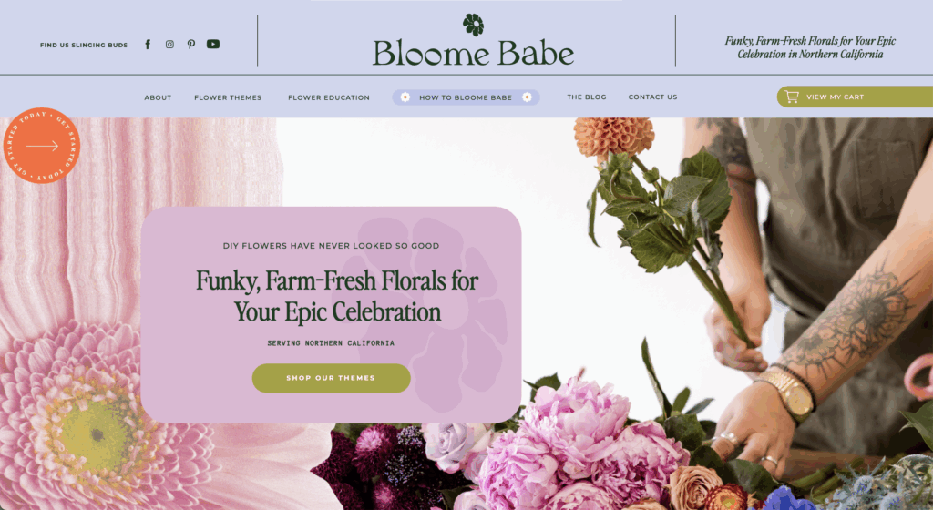
Bloome Babe is a floral studio based in Sonoma with a mission to make flowers feel fun, accessible, and anything but cookie-cutter. Everything is sourced directly from local farms, everything is built around sustainability, and everything is designed to invite people into the process instead of gatekeeping it.
The vibe? Whimsical, a little cheeky, and rooted in community. Whether someone’s grabbing flowers for their wedding, subscribing to monthly bouquets, or stopping by the Good Vibes Studio to put arrangements together, the experience should feel easy and joyful—never intimidating.
The Goals
Before I wrote a single headline, we outlined the big goals for the site:
- Differentiate the brand. Bloome Babe wanted to stand out from competitors who felt too safe and same-y.
- Reassure first-timers. DIY flowers can feel overwhelming, so the copy needed to make people feel supported every step of the way.
- Highlight values. From sustainable sourcing to inclusivity, their core values deserved just as much attention as their products.
- Make it approachable. Whether you’re a wedding planner, a bride, or someone grabbing flowers for a birthday dinner, the site needed to feel welcoming to everyone.
The Messaging
The messaging strategy centered on three things:
- Playful. A voice that feels lighthearted and fun, with puns and cheeky one-liners sprinkled in — because flowers should feel exciting, not stiff.
- Supportive. Resources, recipes, and guides are framed as suggestions, not rules. The copy reassures people that there’s no “wrong way” to create with flowers.
- Intentional. Every line reinforces what sets Bloome Babe apart: locally grown flowers, eco-friendly practices, and a business built on inclusivity and joy.

This combination made the site feel less like an online shop and more like an invitation; a place where anyone can join in, learn something new, and feel good about what they’re buying.
My Favorite Part
My favorite part of this project was honestly just how playful and fun the brand is. Bloome Babe gave me full permission to get creative with the language—to make it cheeky, conversational, and a little unexpected.
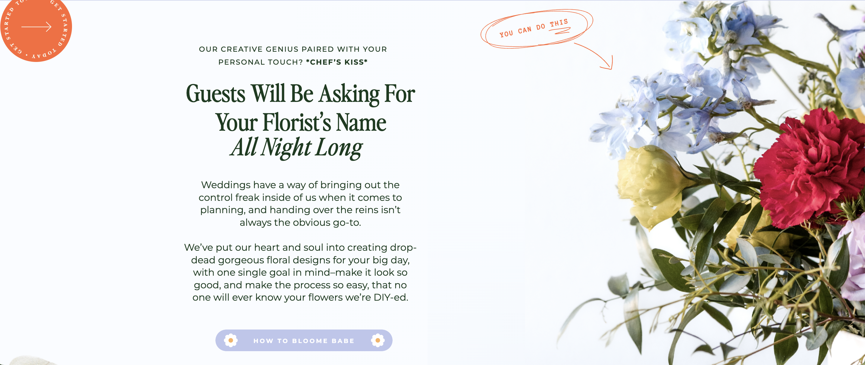
One of my favorite lines from the whole site? “Our creative genius paired with your personal touch? *Chef’s kiss*. Guests will be asking for your florist’s name all night long.” It captures everything I loved about this project: fun, confident, and not afraid to have a good time.
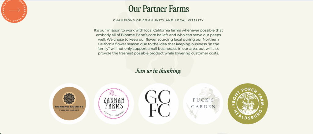
I also loved the chance to champion their local farms and community throughout the copy. Bloome Babe sources all of their flowers from local growers, so every flower they sell is truly farm-fresh. It’s a fantastic way to support other small businesses, and it was a joy to learn more about the farms they partner with.
The Collaborators
This website was really a team effort, and I have to say, everyone is obsessed with the end result.
Copywriting: By Kenz Diamond
Branding + Website Design: Bella Maven Studio
Final Notes
This project was an absolute dream for me. With Bloome Babe, I got to lean into humor, puns, and personality without ever losing clarity or strategy, and the result is a site that feels like the brand itself: bright, bold, and impossible to confuse with anyone else. So, if you ever find yourself in the Northern California area and in need of flowers, you know where to go!


Read the Comments +